
Work / Ćošak
Ćošak: book a cut without calling
A first website for a corner barbershop in downtown Aleksinac. Hours were on a sheet of paper on the door, prices in old posts, and appointments were booked by phone while the barber had scissors in hand. The goal: on one screen, customers see whether the shop is open, what it costs and which slot is free, and book without calling.
CONCEPTNot made for a client. The business, prices and reviews are made up.
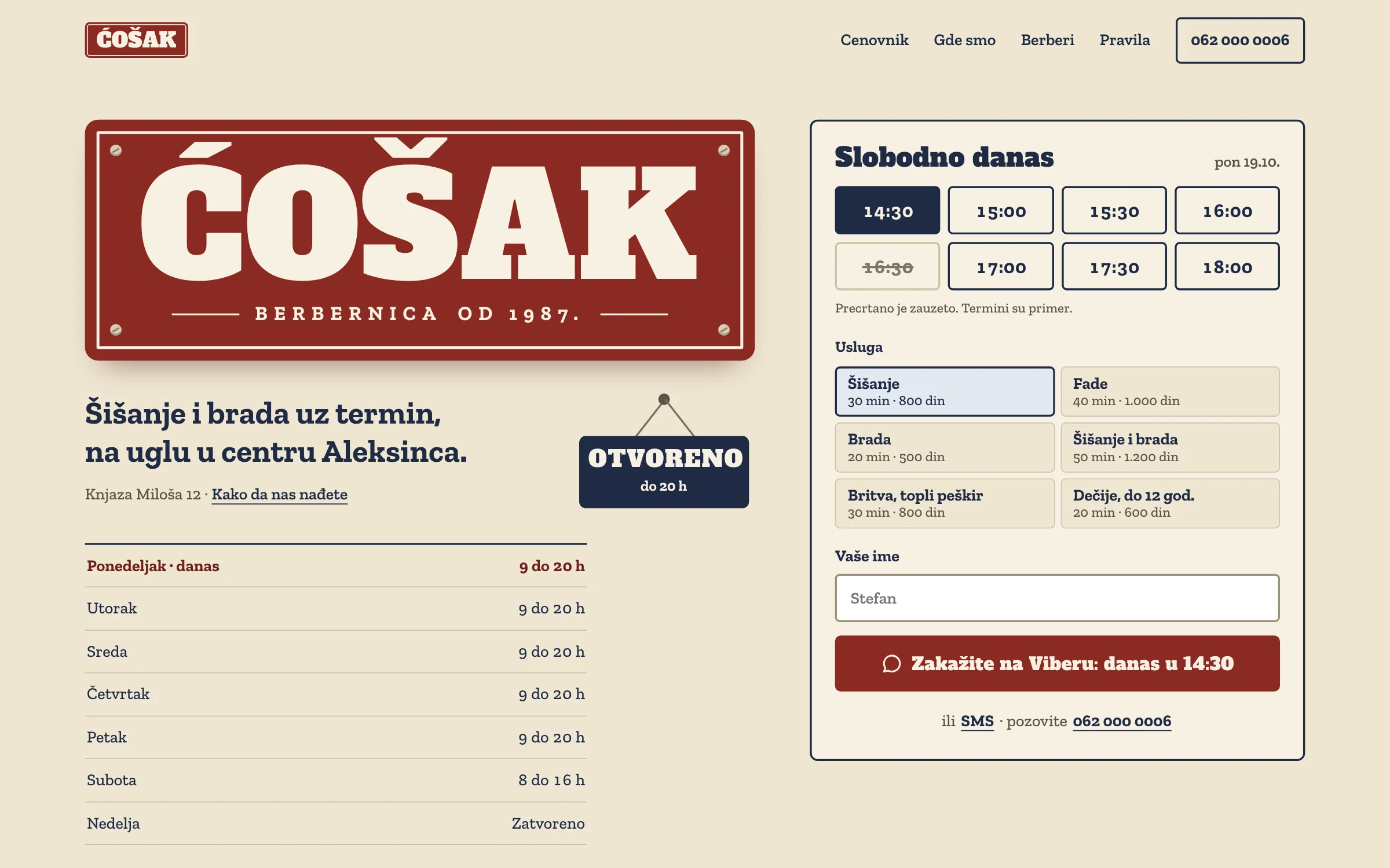
What's wrong and how I think about it
The numbers on the image mark four decisions that replace the phone call in the middle of a haircut. For each one: what's wrong, what I decided and why.
Open or closed, right away
What's wrong
The hours were only on a paper sign on the door. Anyone not standing outside the shop had to call and ask if it was open.
Decision
A sign that reads “Open until 8 PM” or “Closed” based on the time, with the week's hours underneath and today highlighted.
My thinking
It's the most common question, and it has an exact answer. When the site answers it, the phone rings less.
Open slots and prices in one place
What's wrong
Prices were in old posts, and you only found out about a free slot by talking to someone.
Decision
On the right, a “Free today” card: time slots, then services with duration and price. Taken slots are crossed out, and the slots offered respect each service's length and the shop's hours.
My thinking
Customers pick a time and a service like they would in the shop, with a glance at the board. The price sits next to the service, so nobody has to ask.
A message with the time, no call
What's wrong
The barber either answers with scissors in hand or doesn't answer at all. A missed call is a missed appointment.
Decision
A “Book on Viber: today at 2:30 PM” button opens a message with the time, service and name. Next to it, text and call options.
My thinking
The barber reads the message between two customers and confirms with one word. No booking app and no monthly subscription.
The corner sign
What's wrong
The shop has been open since 1987 and lives on regulars, but online all it had was a paper sign and old posts.
Decision
Cream, burgundy and navy, like old enamel signs: the name on a screwed-on plate, a sign on the door and a street sign with the house number.
My thinking
Regulars come out of habit and trust. The site should feel like the corner shop they already know.
Before and after
Drag the slider across the phone: one workday of missed calls, and the same phone with the new site.
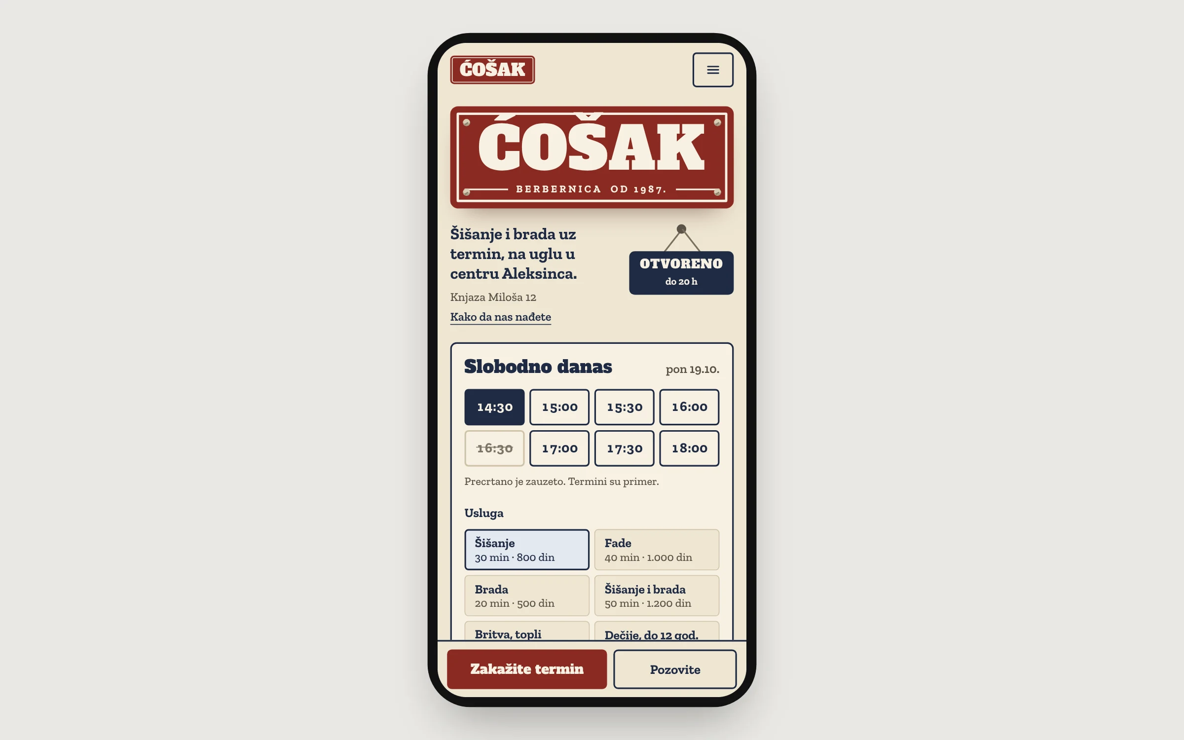
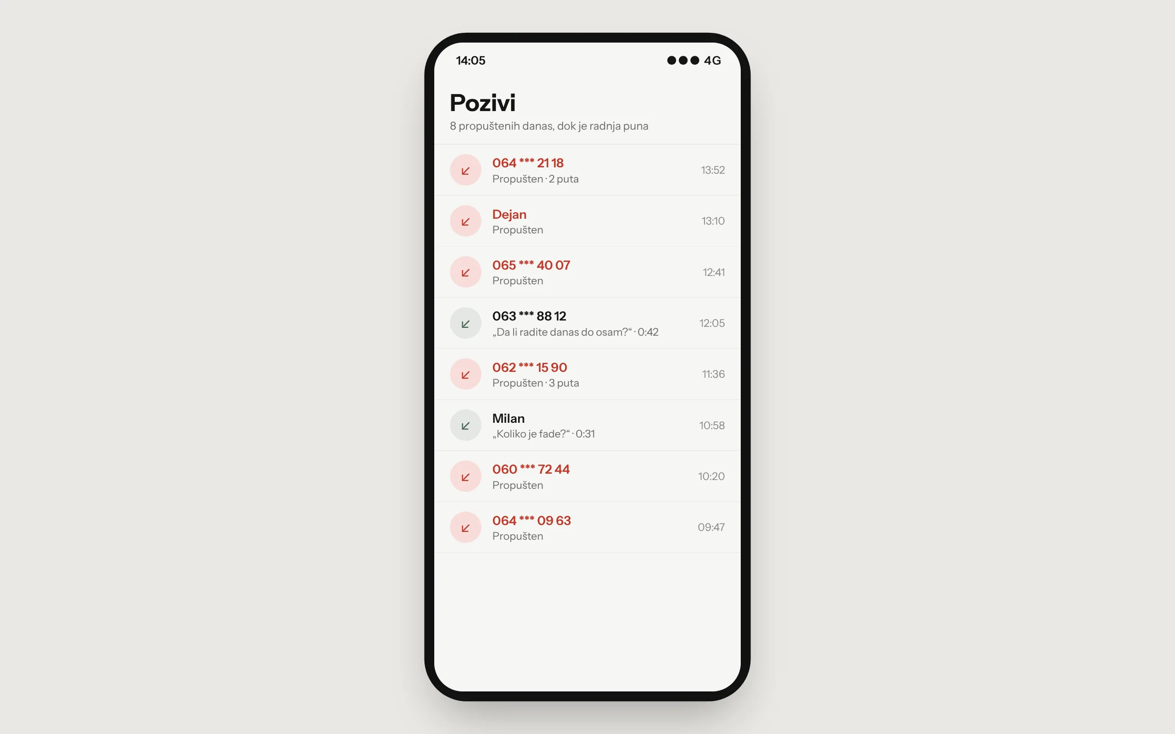
The calls and site were made up for this example and don't show any real business.
How I'd measure success
This is a concept, so there are no results yet. With a real client, I'd track this:
Bookings by message
How many bookings come in each week through Viber messages from the site.
“Are you open?” calls
Whether there are fewer after the site. The barber counts for a week before and after.
Google ranking
For searches like “barber Aleksinac” and “men's haircut Aleksinac”.
System
Cream like enamel, burgundy for the sign and main button, navy for text and the selected slot. Alfa Slab One for the name and headings, Zilla Slab for text and prices.
Šišanje 800 din