
Work / Apartmani Sunce
Apartmani Sunce: a site that leads to inquiries
A redesign for four apartments in Novi Sad. The old site had all the information, but visitors didn't know where to look. The goal: within seconds, they see where the place is, what it costs and how to inquire.
CONCEPTNot made for a client. The business and the old site are made up.
What's wrong and how I think about it
The numbers on the image mark four places where the old site lost inquiries. For each one: what's wrong, what I decided and why.
A headline that says where you are
What's wrong
The headline was “Welcome to our website!!!”. It doesn't say where the place is or why to pick it.
Decision
Location and the main advantage in the headline: Liman, 5 minutes from Štrand beach.
My thinking
Guests choose a place by location. A greeting tells them nothing.
The price right under the headline
What's wrong
The price said “on request”, in a table halfway down the page.
Decision
From €45 a night for the whole apartment, right under the headline. The calendar shows the price for the selected nights.
My thinking
If people can't see a price, they call someone else or go to Booking.com.
Two clear ways to inquire
What's wrong
Not a single button. The phone and email sat in small print in the footer.
Decision
The selected dates go to WhatsApp in one tap. If you'd rather use a form, the link is right below.
My thinking
Some people like forms, some like messages. Both lead straight to the owner.
An inquiry with exact dates
What's wrong
Open dates weren't visible, so every booking started with a phone call.
Decision
A calendar card that sends an inquiry for the selected dates.
My thinking
The owner gets an inquiry with every detail, without the back-and-forth of “which dates?”. It isn't a booking system, just an inquiry that arrives right away.
Before and after
Drag the slider to compare the old and new site on the same screen.
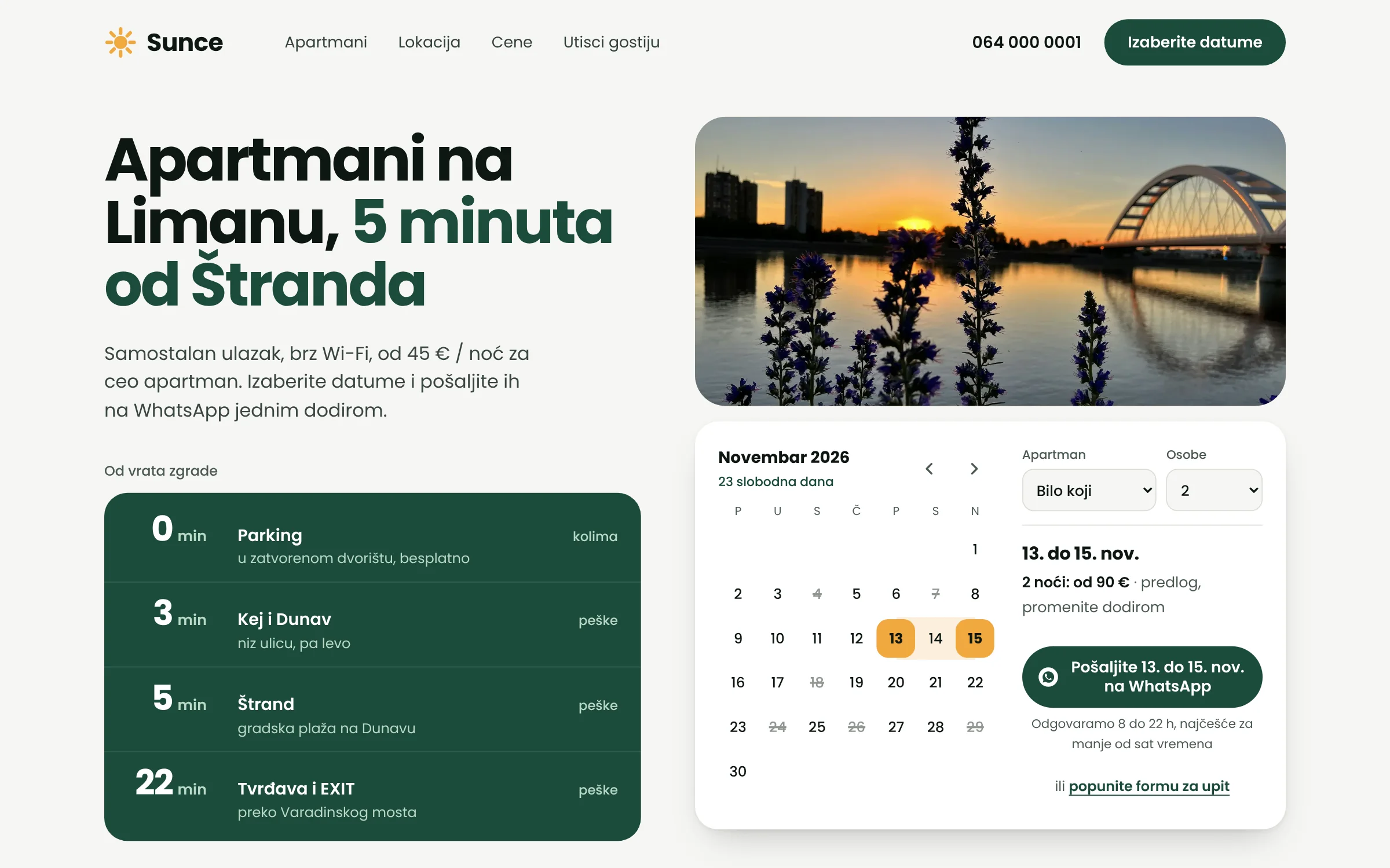
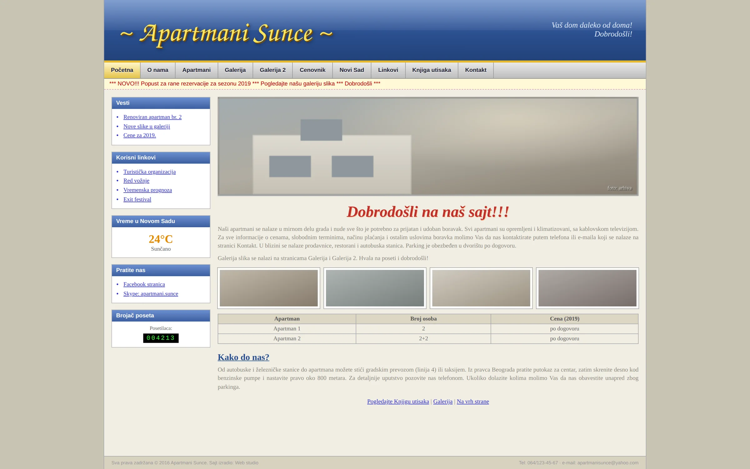
The old and new sites were made up for this example and don't show any real business.
How I'd measure success
This is a concept, so there are no results yet. With a real client, I'd track this:
Form inquiries
How many date inquiries come in each month, compared with the number of calls before.
WhatsApp clicks
How many visitors choose a message over the form.
Google ranking
For searches like “apartments Novi Sad Štrand”.
System
A warm light background, green for trust and orange like the sun in the name (sunce means sun). One font, bold and easy to read on a phone.
Apartmani na 5 minuta od Dunava